Makiko Fukaya
Motion Art Director

Brand Concept
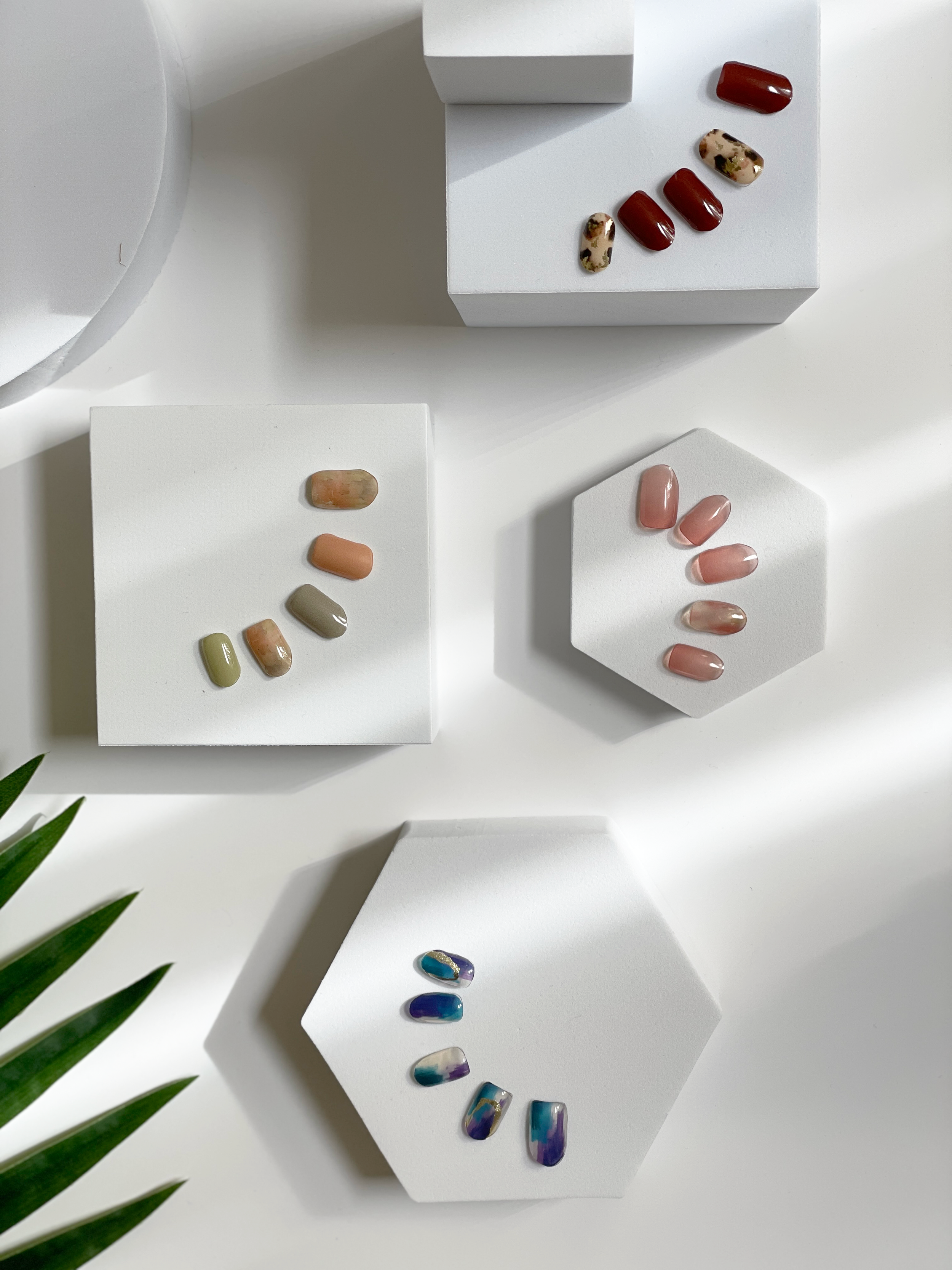
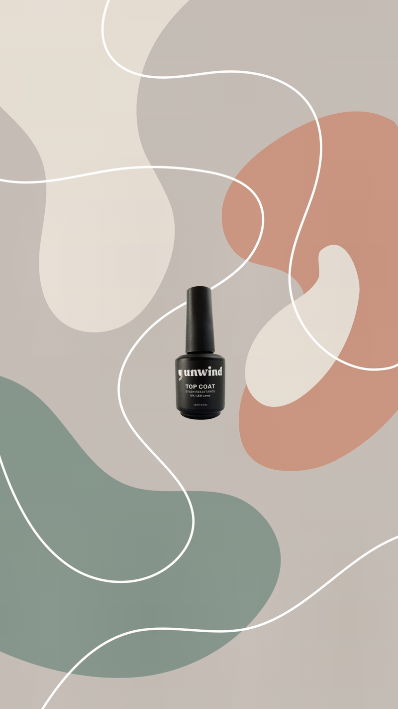
Comma Unwind is a semi-cured gel nail brand that celebrates self-care with a passion for delivering beautiful yet affordable nails to customers’ doorstep.
Your job, Your family. Taking care of you seems insignificant at times. Comma Unwind’s purpose is for you to unwind with a little glam. Breathe, Unwind, Smile at your new nails.
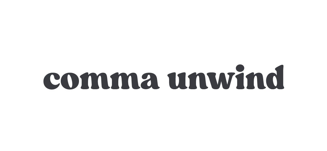
Logo

,Simplicity ,Modern ,Statement
A comma is a key to unifying the entire concept of Comma Unwind and driving the branding.
I created a logo influenced by a comma shape and applied a modern elegance vibe. It is also functional as a statement.
The Comma Unwind logos have three variations: text only, comma symbol + text, and just comma symbol.


Copywriting
The voice and tone: Authentic, Personal, Kind
I approached with a metaphor comparing life with a sentence. If our lives are likened to long sentences, we need to have commas to breathe and take a break from life.
Through this approach, I intended to create a symbolism to remind people to take a moment for self-care during busy times through copywriting.
Color & Typeface
Modern, Chic, Feminine, Fashion-forward, Sleek, Polished


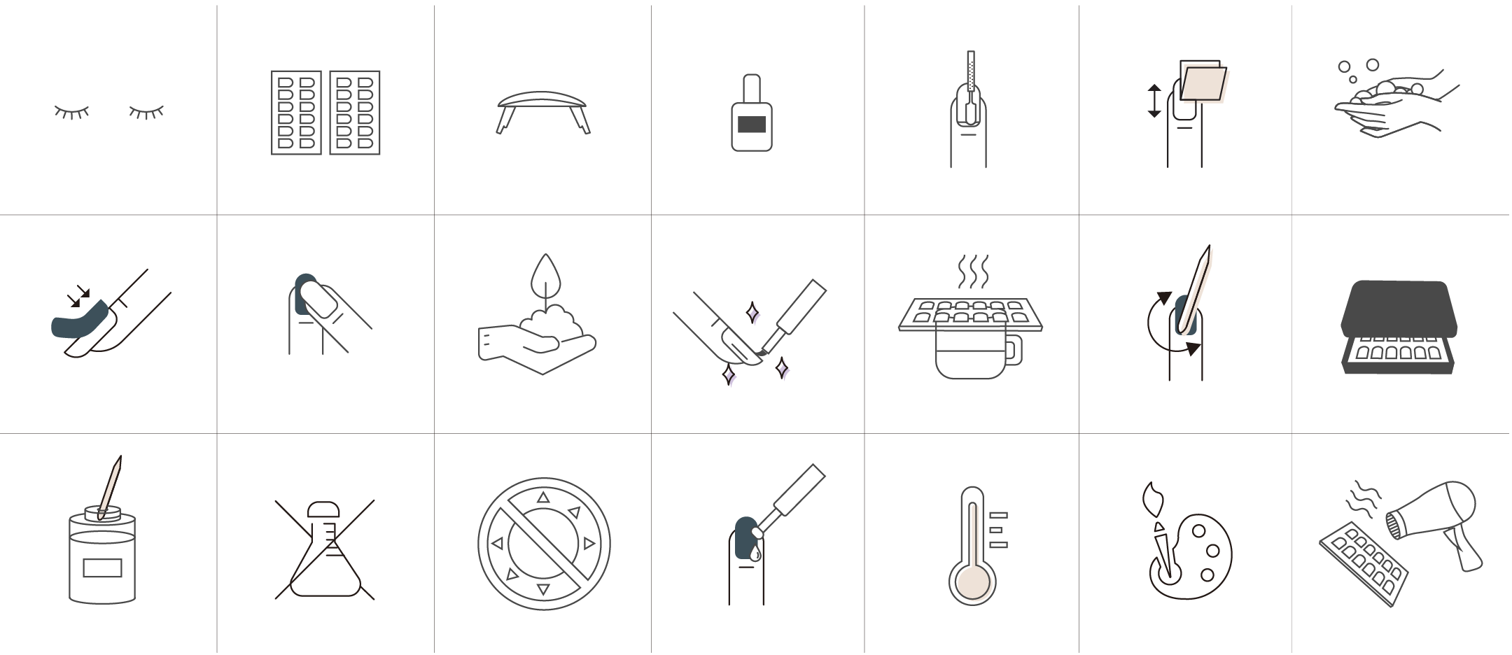
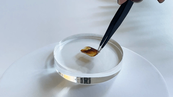
Illustration
Implementation
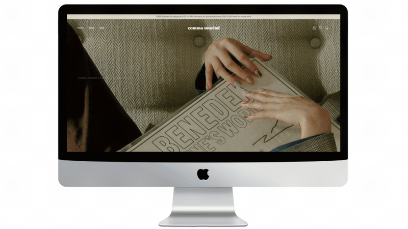

Want to see how Comma Unwind was made? >>> Shoutout LA